
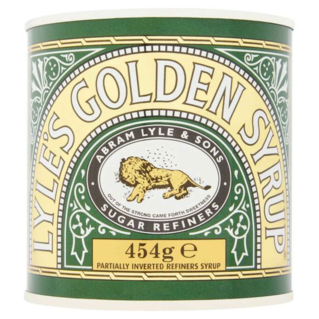
There are some brands that no marketer should, would or could ever change: the Lyle’s Golden Syrup tin, for example, with its iconic — in the real meaning of the word — illustration of a dead lion surrounded by bees (which Victorians would have understood immediately), and its biblical quote. And there are some that were never so great even when they first appeared, but which time has made a familiar part of our visual world. Such a brand is Anchor, the San Francisco brewery rightly revered for its hugely influential role in the American beer revival.
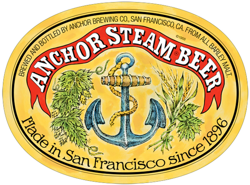
The faux-antique bottle labels Fritz Maytag introduced as part of his shake-up of the failing business he acquired in the late 1960s certainly made the brand stand out on the shelves compared to the sleek designs of the megabrewers he was competing against. But they were always rather messy, deliberately hand-drawn to emphasise the “craft” nature of the product inside. As Anchor grew and as the craft brewery revolution it helped inspire exploded into thousands of competing beer brands, the bottle “dress” it had adopted began to look increasingly not so much charmingly old-fashioned as drab and out of date.
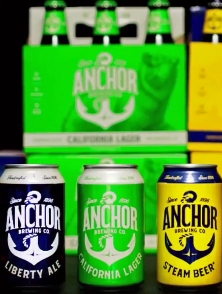
Now, some half a century after they were introduced, the old-style labels have been replaced by a smart, clean, clear design that actually increases the stand-out on the shelf, with well-tempered graphics and a pleasing uniformity across the range, which was almost totally lacking before. And oh, the howls of pain from the beer cognoscenti, not just in the US but in the UK. You would think someone had murdered their granny.
I can understand Pete Brown being pretty annoyed: it is literally only a couple of months since he published a book on beer branding, Beer By Design, that praised the “classic” look of Anchor’s labels, hailing a company which “hasn’t wavered in its design approach in over forty years.” And just as that book hits the shops, the feckers at Anchor make it immediately out of date by throwing the “classic” design Pete salutes out of the brewery window, and bringing in something entirely different. I’d be pissed off, too.
But that apart, I’m puzzled by what this love for a 1970s pastiche of early 20th century beer labels is grounded in. It’s like praising a 1950s trad jazz band, when you’ve got King Oliver’s Dixieland Syncopators or Louis Armstrong’s Hot Five: the originals are strong and vibrant, the replicas washed out and lacking life. The design of the “classic” Steam Beer label is a crowded mess, the name of the beer only the second most prominent part of the label, at best, with some kind of odd parchment effect in the background making it look as if the colours failed to fix properly on the printing plates. The Porter label is better, being simpler and more direct, but still with distracting clusters of barley and hops that detract from the impact. Pete Brown put the “classic” Anchor labels in a section of Beer By Design called “Nostalgia”, but if you want nostalgia done well, some of the other examples in that chapter, such as the Shepherd Neame “classics collection” labels, or the J.W. Lees pumpclips, are vastly better: rooted in the past, but strong and direct. (Beer By Design is an excellent book, by the by: well worth adding to your library.)
I certainly can’t agree with those who have attacked the new design as “unnecessary”, “painful”, “missing the mark”, “boring”, “generic” and “uninspiring”, to list just a few of the criticisms thrown at it on Beer Twitter. And I don’t understand the claims that the new designs won’t have the ability to stand out on the shelf the way the old labels – allegedly – did, or that they look like generic supermarket own brands, two statements that are actually mutually contradictory, the point of generic supermarket own brands’ design being that it’s meant to stand out on the shelf.
Anchor’s new look is a firmly stated, plain dressing, with some excellent, if subtle, typographical touches: I love the way the serif on the A has a slightly wind-swept look that matches the serif on the tail of the R. The “fouled anchor” (technical term there, heraldry buffs) and the name Anchor in that typeface is a sturdy piece of branding that carries well across the whole of the brewery’s range, as does the use of blocky, clean colours for each individual beer.
Is it too much of an attempt to “get down with the kids” from a brand that should, in fact, be happy in its relaxed seniority? No, I don’t believe so. Drinkers who were 18 when the original design first appeared are nudging 70 now. There are generations of beer lovers who don’t know the Anchor story, and don’t know how important it was in helping to develop the beer scene they enjoy now. Anchor needs to be seen as relevant by those drinkers, to continue to recruit new cohorts of customers, as every brand must if it wants to live, and the old design, literally your granddad’s design, wasn’t going to do that. The new design is much better placed to carry Anchor forward.

I’m with Pete on this one, in the thumbs down crowd. Just a matter of taste, clearly. While MC likes the clean look of the new and decries the old as “a mess, frankly,” I see the new as sterile, the old as a feast of color and delight.
I can see the issue with the current branding, i can see why they wanted to change as well. I’ve seen quite a lot of rebrands in the past few years and the content generated around them, I didnt like the content and didnt think the design or the message was particularly relevant to me, then I understood… it wasn’t meant for me, I’m no longer their target audience.
The new design won’t mean people who like the beer will stop buying it, they already know what its about, but it might mean people who didn’t may now consider it and that’s who the design is intended for.
True, this. I have no intention of not drinking Anchor because of a label switch, and Liberty Ale is perhaps my all-time favorite beer. And in really important news, my wife is getting vaccinated next week!
I agree, the old label was rooted in a very specific time and place of San Francisco in the late 60s, and I think a company takes a huge risk if it cuts its ties with its roots — if those roots are solid, which I think they are with Anchor.
From a branding perspective, I think the old Anchor labels have become real standouts by pointing to a 1969 aesthetic. You think of bulk organic food stores, used record places, and bike repair shops. I’m sure at launch they were pretty anonymous, but after five decades they’re survivors. You get labels today that are throwbacks to the 1800s, you have jokey labels and modern stylized labels, but maybe only Sierra Nevada among major brands matches the Anchor style.
As a logo, the old anchor was a mess, to be sure. But I think it would have been possible to rethink how the logo piece might be refreshed while incorporating it into the look and feel of the old label.
I don’t have any problem with the switch or the new labels (though I think things are a bit out of proportion–a quibble). But I do think you may have missed a piece of the reason the old label is more than a “pastiche”–and you might need to be an American of a certain region to get it. It is 100% 1960s San Francisco. It’s wholly of a piece of the hand-lettered bills that hippies posted on every telephone poll for local shows to lost kittens.
SF in the ’60s did feature a heavy dose of Americana nostalgia (even psychedelic music was electrified roots) and I understand why people might not love that. But you can no more remove the elements of a beer label from its time and place than you can a Mondrian–context is *critical.* Just a few cents from the US West Coast.
An excellent point, Jeff, and one I had indeed missed completely (I didn’t manage to get to San Francisco until 1990, when all that stuff was long over, though I DID get to go round the Anchor brewery …) But if your branding is still reflecting hippie values, three generations on, even more reason to change it, surely …
Yes, absolutely. I was just making a minor point about the old labels.
It’s a conundrum that besets any older brewery: how do you hang onto the history and heritage of your company—and the loyalty of longtime customers—while presenting a fresh face to signal to younger potential fans your products may contain some interest?
Anchor has always leaned into history, but that has limited the brand. People always say they love Steam, too, but they really love the *idea* of Steam as they reach for an IPA. Most people in the US fuse Anchor Steam into a single entity, placing the brewery into a box it must escape if it’s going to survive.
I’m with Pete (and Tom) on this one.
Obviously the ‘bean counters’ had a say in this label change …
Anchor relies strongly on its name and history for sales. Its ‘steam beer’ is a classic, but better known for the special brewing technique than the special flavor. And at US$12 for a six-pack, it is overpriced. The Anchor porter — and especially the barleywine — are indeed very nice, but also over-priced. I could name a dozen other American porters and barleywines that as good but a few dollars cheaper.
My impression is that Sapporo (the current owner) is changing the label in a desperate attempt to increase sales. FYI, Sapporo stock price is way down from 1 year ago (Yen2700 to Yen2000).
I think the new design feels rather simplistic and corporate. Rather like all the new dreadful Young’s pub signs. Trying to tie the beers together under uniform branding feels a little dull and personality-free. I don’t begrudge them an update, the 1960’s nostalgia couldn’t last forever (especially if sales are struggling).
They missed a chance to go deeper into the past and reflect some of the pre Maytag branding though. The old rope circle red Anchor trade mark is lovely and could have been used as a greater inspiration.
On their new slogan “Raise your Anchor” Isn’t the nautical term “Weigh Anchor”??
not as catchy but great for pedants.
Coincidentally having not had any Anchor beer since I was back in SF well over a decade ago I bought some bottles on offer in ASDA this week and was drinking a glass when I came across Martyn’s post. Nice enough beer and the (old) label is let’s say distinctively cute in a sort of pastiche, homespun, of its time way.
I can see that perhaps a subtle update might have been due but I have to disagree with MC, I believe it could have been done with more sympathy to the not insignificant heritage of this brand. Looking at the new branding on the photo shown it appears to me to be unexceptional, bland and shows no particular mindfulness of what has gone before.
The only common factor with the branding it has replaced is that it is very much of its time, but I suspect will date much sooner. I daresay a slick Californian agency will have made good money from the exercise but it is a lost opportunity in my humble opinion.
It is the first time I ever saw the original Anchor label. It reminded me more of a can of sardines. But I do think they could have done better to modernise it, and still retain some of its authenticity. When following the words of Antoine De St.-Exupéry, “Perfection is Achieved Not When There Is Nothing More to Add, But When There Is Nothing Left to Take Away”, it looks to me that too much has been taken away, even though I am a supporter of “Less is More”.
Funny Jürgen, I hadn’t thought about the old label looking like a can of sardines, it never occurred to me until you mentioned it. I am guessing from your name you are not resident in France, but yes, the old label does look a bit like those fancy canned sardines that come from Concarneau in Brittany.
Despite that I do think it is a more interesting and eye-catching design than the new one.
Hi, Damien, I am from Belgium, so France is only a step away 🙂 (And my whole family has always been fans of Brittany)
I agree with you to the extent that the old labels certainly weren’t so brilliant, evocative etc that they should never be replaced with something new. But so does Pete – look at his reference to the changing face of the Budweiser label (of all things). The problem is with this specific new label design, which is simple and bold, lacks any apparent subtlety and generally looks as if it’s been done on the cheap.
As for “standing out on the shelf”, any label consisting mainly of a slab of bright colour will stand out to some extent; what it won’t necessarily do, and what I think people are actually talking about here, is “catch the eye of craft beer drinkers”. (Which is also why most craft beers don’t have flat bichromatic labels like these.)
The only Anchor beer we ever get in my area is the Christmas ale and that is only available in one store so… don’t really care.
Anchor has built its reputation on a great beer and a lot of nostalgia. The beer itself has been held up a a fine example of a historical style. It’s not really all that historically correct. The grain bill was a guess by Fritz Maytag and other early collaborators. Historical Steam probably did not have crystal malt. The modern yeast was often borrowed from other local (macro) breweries. The historical hops were probably something like cluster, not Northern Brewer. It’s still a great beer!
That Old Foghorn label though… now that was a classic.
I think the switch to cans played a role in the re-brand. If you take a look at the can design featuring the original logo/artwork, it is messy, amateur-ish, and not appealing. The new cans are much more acceptable- and like it or not, some consumers need that “push of confidence” when purchasing cans.
Overall, I feel like the new design reminds me too much of what we’re seeing in professional sports- likely a consulting group was brought on board, came up with 10-12 design elements, and a board of directors made a final call on the selection. It’s FINE. It’s not ugly but it also isn’t oozing with character. Then again, I’m a big fan of New Glarus’ hand-drawn labels and comic books that are a bit messy.